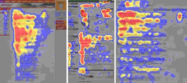
Dominant reading pattern
The dominant reading pattern looks somewhat like an F and has the following three components:
- Users first read in a horizontal movement, usually across the upper part of the content area. This initial element forms the F's top bar.
- Next, users move down the page a bit and then read across in a second horizontal movement that typically covers a shorter area than the previous movement. This additional element forms the F's lower bar.
- Finally, users scan the content's left side in a vertical movement. Sometimes this is a fairly slow and systematic scan that appears as a solid stripe on an eyetracking heatmap. Other times users move faster, creating a spottier heatmap. This last element forms the F's stem.
Sometimes users will read across a third part of the content, making the pattern look more like an E than an F. Other times they'll only read across once, making the pattern look like an inverted L.

Implications of the F Pattern
The F pattern's implications for Web design are clear and show the importance of following the guidelines for writing for the Web instead of repurposing print content:
- Users won't read your text thoroughly in a word-by-word manner.
- The first two paragraphs must state the most important information. There's some hope that users will actually read this material, though they'll probably read more of the first paragraph than the second.
- Start subheads, paragraphs, and bullet points with information-carrying words that users will notice when scanning down the left side of your content in the final stem of their F-behavior. They'll read the third word on a line much less often than the first two words.