Anti-aliased fonts
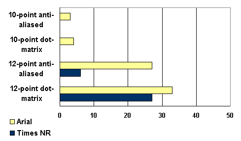
Comparing aliased and anti-aliased Times New Roman and Arial fonts at 10- and 12-point sizes found that the 12-point anti-aliased Arial font tied for second in preference, as well as being judged as the third to most legible font presented (Bernard & Mills, 2000). The 10-point Times New Roman font was not ranked first or second by any participant.

However, one should use caution in creating anti-aliased text that is based on a graphical image, such as with a JEPG or GIF, because they are "fixed" at a particular font size that may be too small to be read by a certain population of users (i.e., vision impaired). It is therefore recommended that text which cannot be size-adjusted (because it is part of an image, etc.) should be at least 3 mm in height. In addition, all graphics should make use of the alternative text function (alt=" " ) so that users who cannot see the text images can have the text image descriptions presented or read to them by a text reader.
Older Adults are more accurate with, and prefer larger font sizes. They also prefer sans serif fonts over serif fonts
As discussed by Bernard, Liao, and Mills (2001) reading online documents (about 2 pages), older adults significantly preferred the larger, 14-point font size (see Figure 4 below). In this study, serif fonts (Georgia and Times New Roman) were compared to sans serif fonts (Arial and Verdana) at 12- and 14-points. The 14-point fonts were found to be more legible, promote faster reading, and were preferred to the 12-point fonts. Also, at the 14-point size, serif fonts tended to support faster reading (see Figure 6). Examining participants' 1st and 2nd preference choice further shows the popularity of the 14-point size.
The sans serif fonts were, however, generally more preferred than the serif fonts. This finding is supported by Sorg (1985), which found that older adults preferred to read Helvetica, which is a sans serif font similar to Arial, compared to Century Schoolbook, which is a serif font.